In our last post, we looked at tactical allocation using valuation metrics and trend-following measures.
Our conclusion from the analysis is that discerning robust trading signals based on market valuations is difficult at best.
This research piece attempts to dig a little deeper and addresses the following questions:
- Opportunity Costs
- How do other asset classes perform during different CAPE regimes? Why go all-in on equity if bonds are the asset class that outperforms?
- Diversification
- Do we abandon diversification and shift heavily into equities following cheap markets?
- Real Equity Premium
- CAPE ratios are absolute pricing measures, but what we care about is the equity premium. If equity is expected to earn 15% real and bonds are expected to earn 15% real, equity isn’t cheap.
Strategy Background
The following 3 data series are used in our tests:
- LTR: Merrill Lynch 7-10 year government bond index—ML1US10 INDEX
- SPX: SP500 Total Return Index—SPXT INDEX
- Shiller P/E: Shiller’s Cyclically Adjusted PE ratio—10-year average real earnings /real price
Simulation results are from January 1, 1929 through April 30, 2014.
No transaction costs are included in any of our analysis. All results are gross of any transaction fees, management fees, or any other fees that might be associated with executing the models in real-time. The results are hypothetical results and are NOT an indicator of future results and do NOT represent returns that any investor actually attained. Indexes are unmanaged, do not reflect management or trading fees, and one cannot invest directly in an index. Additional information regarding the construction of these results is available upon request.
Shiller P/E and Market Performance (1/1/1929 to 4/30/2014)
- Shiller P/E and S&P 500 Over Time
- Low Shiller P/Es, on average, are followed by bull markets over long cycles.
- The figure to the right plots the Shiller P/E over time (left axis) and the S&P 500 return series over time (right axis).
- Log scale.
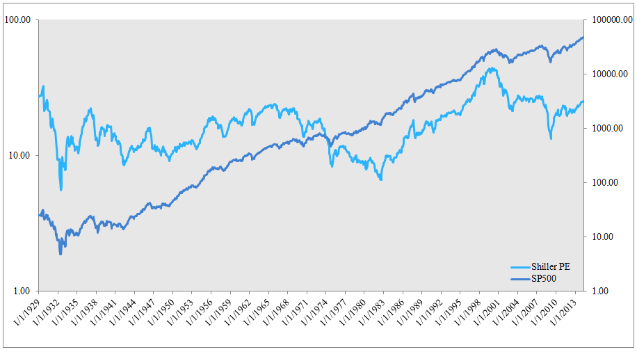
The results are hypothetical results and are NOT an indicator of future results and do NOT represent returns that any investor actually attained. Indexes are unmanaged, do not reflect management or trading fees, and one cannot invest directly in an index. Additional information regarding the construction of these results is available upon request.
Opportunity Costs
Given a Shiller P/E starting point, what do subsequent 3-year stock and bond returns look like?
- Low valuation implies higher expected future stock returns, on average.
- Bonds are fairly stable across equity valuation regimes, but also see a boost during the cheapest market environments.

The results are hypothetical results and are NOT an indicator of future results and do NOT represent returns that any investor actually attained. Indexes are unmanaged, do not reflect management or trading fees, and one cannot invest directly in an index. Additional information regarding the construction of these results is available upon request. The figure plots different Shiller P/E regimes (X-axis). For example, “15-16” represents all historical samples when the S&P 500 was priced between a 15 and a 16 Shiller P/E. Compound annual growth rates (CAGR) are presented on the Y-axis. All CAGRs are calculated over 3-year periods. We test periods ranging from 1 to 5 years and find similar results.
Given a Shiller P/E starting point, what do subsequent 3-year Sharpe ratios look like?
- Stocks show a relationship between risk-adjusted returns and valuation, but the correlation is not as strong as Shiller P/E level and 3-yr CAGR (chart above).
- Bonds have strong risk-adjusted returns across equity valuation regimes, to include the extreme cheap and extreme expensive equity valuation regimes (bonds actually outperform at the extremes).
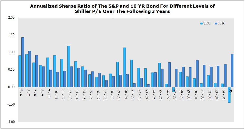
The results are hypothetical results and are NOT an indicator of future results and do NOT represent returns that any investor actually attained. Indexes are unmanaged, do not reflect management or trading fees, and one cannot invest directly in an index. Additional information regarding the construction of these results is available upon request. The figure plots different Shiller P/E regimes (X-axis). For example, “15-16” represents all historical samples when the S&P 500 was priced between a 15 and a 16 Shiller P/E. Sharpe ratios are presented on the Y-axis. All Sharpes are calculated over 3-year periods. We test periods ranging from 1 to 5 years and find similar results.
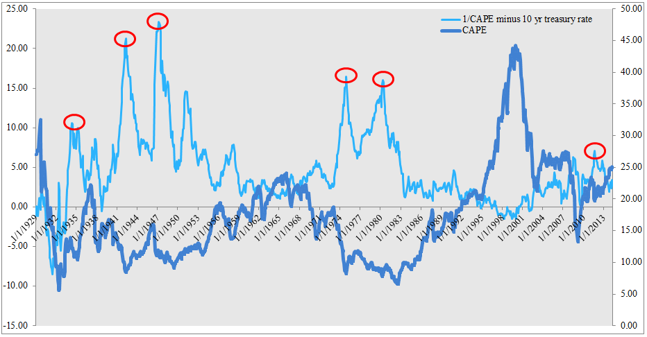
Digging deeper into extremely cheap markets
The figure below plots the Shiller P/E over time (left axis) and the S&P 500 return series over time (right axis). We highlight prominent valuation troughs with red circles. In the analysis that follows we examine the detailed performance data for stocks and bonds.
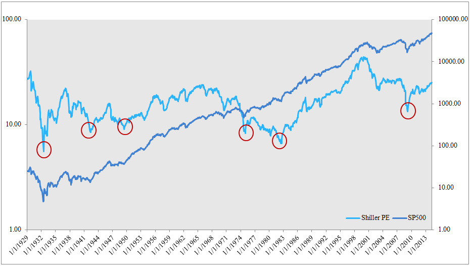
The results are hypothetical results and are NOT an indicator of future results and do NOT represent returns that any investor actually attained. Indexes are unmanaged, do not reflect management or trading fees, and one cannot invest directly in an index. Additional information regarding the construction of these results is available upon request.
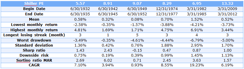
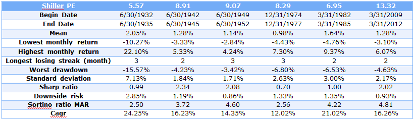
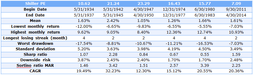
S&P Statistics Summary
The following table contains the statistics for various Shiller PE regimes (each column represents a red circle above).

The results are hypothetical results and are NOT an indicator of future results and do NOT represent returns that any investor actually attained. Indexes are unmanaged, do not reflect management or trading fees, and one cannot invest directly in an index. Additional information regarding the construction of these results is available upon request.
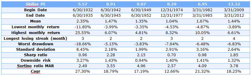
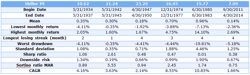
LTR Statistics Summary
The following table contains the statistics for various Shiller PE regimes (each column represents a red circle above).
The results are hypothetical results and are NOT an indicator of future results and do NOT represent returns that any investor actually attained. Indexes are unmanaged, do not reflect management or trading fees, and one cannot invest directly in an index. Additional information regarding the construction of these results is available upon request.
Conclusion on Opportunity Costs
On Sharpe ratio basis, stocks outperform in the 49-52, 74-77, and the 09-12 bear markets.
On Sortino ratio basis (MAR = 5%), stocks outperform in the 49-52, 74-77, 82-85, and the 09-12 bear markets.
Stocks AND bonds are interesting during cheap equity markets.
Diversification
Given a trough Shiller P/E starting point, what does a diversified allocation between stocks and bonds do for the investor?
The common story is that cheap stock markets warrant a wholesale move into equities.
50/50 Statistics Summary (50% equity; 50% 10-year bonds)
The results are hypothetical results and are NOT an indicator of future results and do NOT represent returns that any investor actually attained. Indexes are unmanaged, do not reflect management or trading fees, and one cannot invest directly in an index. Additional information regarding the construction of these results is available upon request.
60/40 Statistics Summary (60% equity; 40% 10-year bonds)
The results are hypothetical results and are NOT an indicator of future results and do NOT represent returns that any investor actually attained. Indexes are unmanaged, do not reflect management or trading fees, and one cannot invest directly in an index. Additional information regarding the construction of these results is available upon request.
Conclusion on Diversification
Diversified stock/bond portfolios following trough Shiller P/E events typically outperform single position portfolios in either stocks or bonds independently.
- Diversification always matters
Real Equity Premium
Absolute valuation metrics may not precisely capture the benefit/cost to holding risk. In other words, a P/E of 20x doesn’t mean anything in a vacuum.
Any first year finance student will tell you that expected equity returns will roughly equal the risk-free rate plus an equity premium. Why anchor on the risk-free rate and why add an equity premium? Well, the risk-free rate is what you get in your checking account–so that is the baseline we should all expect from ANY asset class. Next, ask yourself, Who would hold risky equity if there was no extra kick in performance over stashing the cash in the checking account?…that is the equity premium…the extra return we get for taking on risk.
Understanding the “RF +equity premium concept” helps us better understand why absolute valuation levels may not capture true equity market valuations. For example a P/E of 10 (a 10% earnings yield) with a 10-year yield of 15% may imply an expensive equity market (-5% equity premium) relative to a situation where the P/E is 20x (5% earnings yield) and the 10-year yield is 1% (+4% equity premium). The P/E in the second scenario signals “expensive,” but on a equity premium basis, stocks are cheap relative to the scenario where the P/E is 10.
We test how stocks and bond perform during different Real Equity Premium periods, where Real Equity Premium = 1/CAPE [Earnings Yield] – Real 10-year yields (Note: CAPE is already in “real” terms).
The figure below plots the Shiller P/E, or cyclically-adjusted P/E (CAPE), over time (right axis) and the Real Equity Premium (1/CAPE – Real Treasury Yield) (left axis). Extreme spread events are highlighted with red circles.
The results are hypothetical results and are NOT an indicator of future results and do NOT represent returns that any investor actually attained. Indexes are unmanaged, do not reflect management or trading fees, and one cannot invest directly in an index. Additional information regarding the construction of these results is available upon request.
Real Equity Premiums tend to roughly correspond with trough Shiller P/Es, but not always (e.g., 1947)
Real Equity Premium Performance Characteristics
Given a Real Equity Premium starting point, what do subsequent 3-year returns look like?
- Future stocks appear to have a relationship between Real Equity Premium, but the correlation is weak.
- There is no clear pattern between Real Equity Premium and future bond returns.
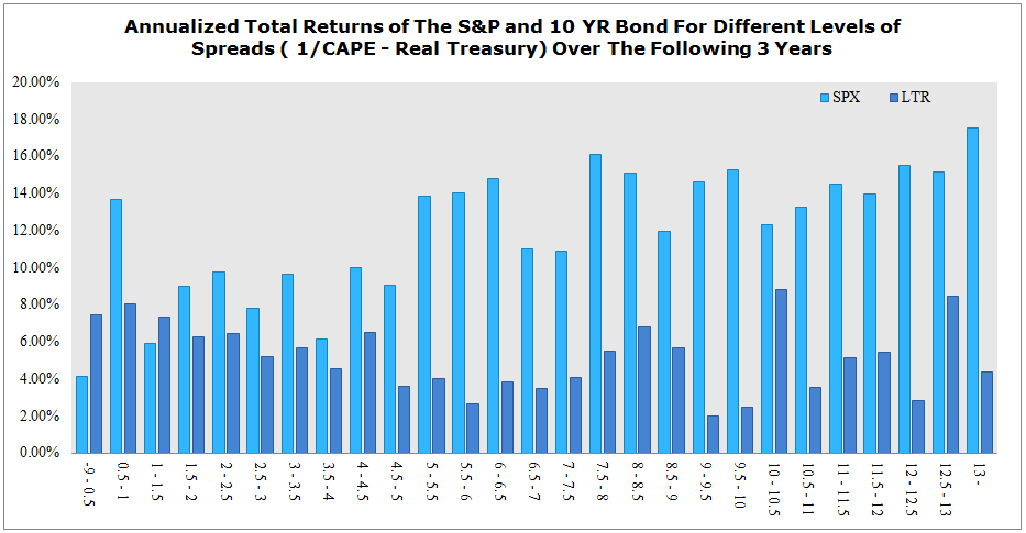
The results are hypothetical results and are NOT an indicator of future results and do NOT represent returns that any investor actually attained. Indexes are unmanaged, do not reflect management or trading fees, and one cannot invest directly in an index. Additional information regarding the construction of these results is available upon request. The figure plots different Real Yield regimes (X-axis). For example, “7-7.5” represents all historical samples when the 1/CAPE – 10-Year Treas was priced between a 7% and a 7.5%. Compound annual growth rates (CAGR) are presented on the Y-axis. All CAGRs are calculated over 3-year periods. We test periods ranging from 1 to 5 years and find similar results.
Given a Real Equity Premium starting point, what do subsequent 3-year returns look like?
- Future stocks appear to have a relationship between Real Equity Premium, but the correlation is weak.
- There is no clear pattern between Real Equity Premium and future bond or stock returns.

The results are hypothetical results and are NOT an indicator of future results and do NOT represent returns that any investor actually attained. Indexes are unmanaged, do not reflect management or trading fees, and one cannot invest directly in an index. Additional information regarding the construction of these results is available upon request.
Real Equity Premium Performance Characteristics–Details at Trough Real Equity Premium
S&P Statistics Summary
The following table contains the statistics for various Real Equity Premium regimes (each column represents a red circle above).
The results are hypothetical results and are NOT an indicator of future results and do NOT represent returns that any investor actually attained. Indexes are unmanaged, do not reflect management or trading fees, and one cannot invest directly in an index. Additional information regarding the construction of these results is available upon request.
LTR Statistics Summary
The results are hypothetical results and are NOT an indicator of future results and do NOT represent returns that any investor actually attained. Indexes are unmanaged, do not reflect management or trading fees, and one cannot invest directly in an index. Additional information regarding the construction of these results is available upon request.
50/50 Statistics Summary

The results are hypothetical results and are NOT an indicator of future results and do NOT represent returns that any investor actually attained. Indexes are unmanaged, do not reflect management or trading fees, and one cannot invest directly in an index. Additional information regarding the construction of these results is available upon request.
Conclusions on Real Equity Premium
- High Real Yield periods predict high spreads in CAGRs between stocks and bonds.
- On a risk-adjusted basis stocks tend to outperform bonds
- Diversified portfolios—in contrast to the results for low absolute Shiller P/E event–do not always outperform all-in stock bets.
- Diversification is less valuable and targeted bets may be warranted during high Real Equity Premium periods.
Overall Conclusions
- Bonds perform well across different valuation periods–to include extreme low valuation periods.
- We should stay diversified during low absolute valuation periods.
- We might want to tactically shift towards equity during high Real Equity Premium periods.
- The results highlight a lot of noise and variation in the data. Identifying a “silver bullet” for tactical asset allocation is impossible…but good luck trying.

About the Author: Wesley Gray, PhD
—
Important Disclosures
For informational and educational purposes only and should not be construed as specific investment, accounting, legal, or tax advice. Certain information is deemed to be reliable, but its accuracy and completeness cannot be guaranteed. Third party information may become outdated or otherwise superseded without notice. Neither the Securities and Exchange Commission (SEC) nor any other federal or state agency has approved, determined the accuracy, or confirmed the adequacy of this article.
The views and opinions expressed herein are those of the author and do not necessarily reflect the views of Alpha Architect, its affiliates or its employees. Our full disclosures are available here. Definitions of common statistics used in our analysis are available here (towards the bottom).
Join thousands of other readers and subscribe to our blog.